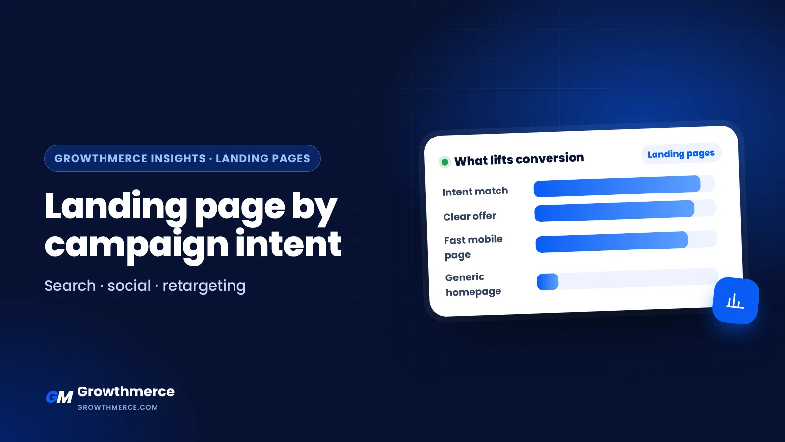
Short answer: Match every campaign to the page that answers the question the visitor arrived with. Cold discovery traffic needs a focused landing page with context and proof, comparison traffic needs a page that helps people decide, high-intent search traffic needs the exact product or booking page, and retargeting traffic needs a short page that removes the reason they left. Growthmerce builds campaigns and landing pages together for stores and service brands in Egypt and the Gulf. See our packages or book a free call.
Most stores send every campaign to the same place: the homepage, the best-selling product page, or a generic offer page. Then they wonder why one campaign converts and another burns budget. The page is often the difference. A visitor who has never heard of your brand and a visitor who already compared three stores need different information, different proof and different next steps.
This guide gives you a decision framework for matching landing pages to campaign intent, so you stop treating every click as if it arrived with the same level of readiness.
Start with intent, not with the page builder
Before you design anything, answer one question for each campaign: what does this person already know, and what do they still need to believe before they buy?
Campaign intent usually falls into four practical buckets:
- Cold discovery: the person did not know you existed. They stopped scrolling because the creative was interesting. They need context, a clear problem statement and a low-friction first step.
- Comparison and consideration: they know the category and are weighing options. They need differences, specifications, proof and answers to objections.
- High-intent action: they searched for a specific product or service and want to complete a task. They need speed, clarity and a short path to checkout or booking.
- Retargeting and recovery: they already interacted with you. They need a reminder, a reason to return, and removal of whatever friction stopped them.
Write the bucket at the top of each campaign brief. If you cannot name it, the landing page will end up trying to serve everyone and converting no one.
Match the page type to the campaign bucket
| Campaign bucket | Best page | What the page must do |
|---|---|---|
| Cold discovery | Focused landing page for one product or offer | Explain, prove, give one easy next step |
| Comparison | Detailed product page, comparison section or filtered category | Remove uncertainty and show differences |
| High-intent search | The exact product, service or booking page | Get out of the way and make action fast |
| Retargeting | Short reminder page or the product page with the objection answered | Address the reason they left |
Cold discovery campaigns
Use a focused landing page built around one product, one problem or one offer. Keep the headline close to the promise in the ad, then expand. Include a short explanation of what the product does, who it suits, and what happens after the click. Avoid dumping the full catalogue on a cold visitor; choice creates hesitation before trust exists.
A useful structure: hook, problem, product as the answer, three to five benefits with proof, simple pricing or offer, objection handling, and one primary call to action repeated.
Comparison campaigns
Send these to a page that helps people decide. That may be a detailed product page with clear variants, a comparison section, or a category page with strong filtering. The job is not to entertain; it is to remove uncertainty. Show the differences that matter, state what is included, and be honest about limitations.
If you sell services, a dedicated page explaining packages, process and what the client receives usually outperforms a general services page.
High-intent search campaigns
These visitors want to act. Send them to the exact page that matches the query: the product, the service, the booking page. Do not route them through a brand story. Keep forms short, show availability and delivery expectations clearly, and make the next step obvious on mobile.
For stores, this is where a clean product page or a streamlined checkout path matters more than a long persuasive essay. See our landing page structure for high-intent paid traffic for a section-by-section layout.
Retargeting and recovery campaigns
Assume familiarity. Skip the introduction and address the reason they left: price concern, delivery doubt, unclear sizing, or simple distraction. A short page with a clear reminder, a relevant incentive if your margin allows, and strong proof often works better than a full sales page.
Keep the message consistent from ad to page
Message match is the cheapest conversion improvement available. If the ad promises a specific outcome, the landing page headline should repeat that outcome in similar language. If the ad shows a specific product, the page should open with that product, not a rotating banner.
Check three things for every campaign:
- The headline echoes the ad’s main promise.
- The visual matches the creative the visitor just saw.
- The call to action matches the campaign goal: buy, book, message or enquire.
Mismatch forces the visitor to re-orient, and re-orientation is where clicks are lost.
Decide between a product page and a dedicated landing page
This is a common source of wasted effort. A dedicated landing page usually wins when the campaign needs a single argument, a specific offer, or a lead form. A product page usually wins when the visitor needs to browse variants, read reviews and compare options before buying.
If you are unsure, our guide on product page versus landing page for ads walks through the trade-offs. For stores on Shopify, the Shopify landing pages for paid traffic guide covers practical setup considerations.
A practical checklist before you launch
- Name the intent bucket for the campaign in one sentence.
- Confirm the landing page headline repeats the ad promise.
- Check that the page has one primary action, not three competing ones.
- Verify the page loads quickly on a mid-range mobile phone.
- Make sure pricing, delivery expectations and what is included are visible without scrolling far.
- Add proof that fits the intent: reviews for cold traffic, specifications for comparison traffic, reassurance for retargeting.
- Test the form or checkout on mobile yourself, including the confirmation step.
- Set up tracking so you can see which page each campaign actually lands on.
- Review results by intent bucket, not only by campaign name.
A clearly hypothetical example
Imagine an Egyptian home goods store running three campaigns. A cold video campaign promotes a bedding set; it lands on a focused page explaining the fabric, sizes and delivery. A search campaign for a specific heater model lands directly on that product page. A retargeting campaign targets people who added the heater to cart but did not order; it lands on a short page addressing delivery timing and payment options. The same store, three intents, three pages. Results will vary by store, but the logic is consistent: the page should answer the question the visitor actually arrived with.
When to review and change the setup
Review your page-to-campaign mapping whenever you launch a new campaign type, change your main offer, or notice a campaign with strong clicks and weak conversion. Before redesigning, check whether the problem is intent mismatch rather than design. Often the fix is a different page, not a new layout.
How Growthmerce helps
- Campaign and landing page planning together, so every campaign has the right destination.
- Landing pages and product pages built on Shopify, WordPress and EasyOrders.
- Tracking that shows which page each campaign lands on and what it sells.
- Reporting by delivered orders, not only clicks.
If you want help auditing your current campaign-to-page setup, compare our packages or book a free call and we will review it with you.